
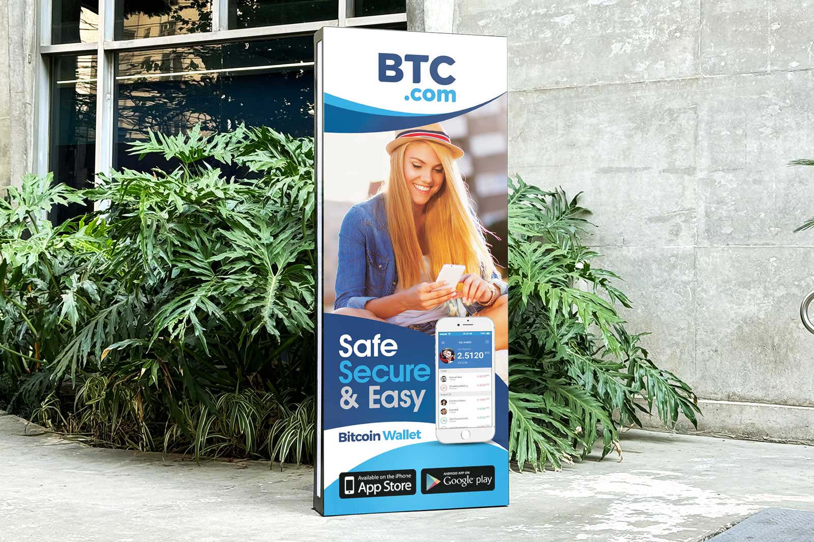
Creating a clearer, more engaging event banner for BTC.com
Overview
The goal of this project was to redesign a promotional roll-up banner for BTC.com, transforming an information-heavy layout into a more engaging and visually focused piece of marketing collateral.
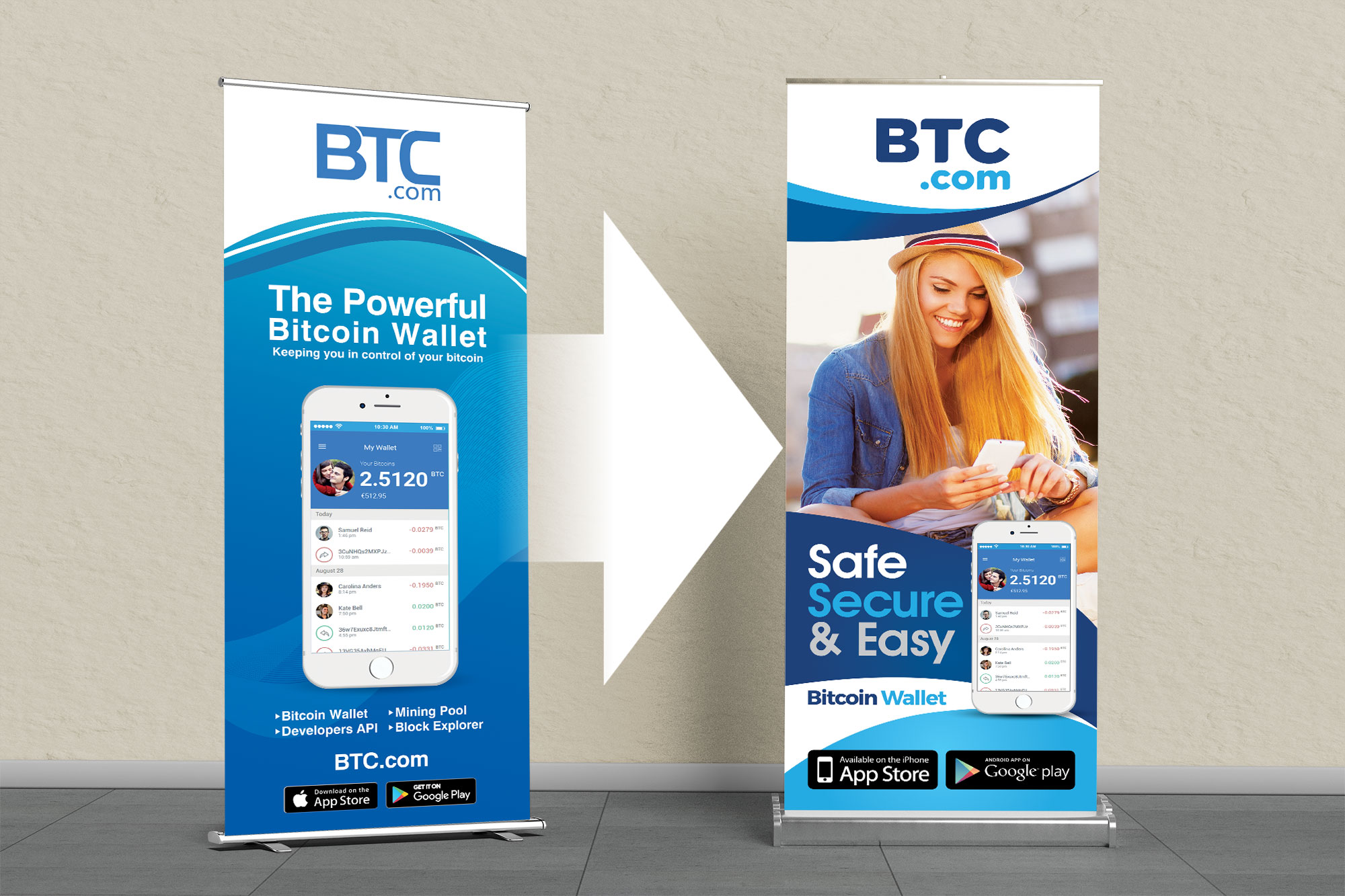
The original banner communicated the key features of the Bitcoin wallet, but the overall composition felt dense and somewhat dated. The redesign introduced stronger visual hierarchy, a more prominent lifestyle image, and a clearer message designed to capture attention from a distance.
The Challenge
A roll-up banner has only a few seconds to make an impression.
The original design contained several competing elements, product messaging, screenshots, feature lists, app store badges, and branding, making it difficult for viewers to immediately understand the main proposition.
The challenge was to simplify the communication without losing the important product information, while making the banner feel more contemporary and approachable.
The Creative Direction
I restructured the banner around a simple visual hierarchy:
Brand → Message → Product → Supporting information → Call to action
Instead of making the Bitcoin wallet interface the dominant visual, the redesign introduced a lifestyle photograph to create a stronger emotional connection with the audience.
The headline “Safe Secure & Easy” became the primary communication point, immediately communicating the product’s core benefits before the viewer reached the supporting information.
The BTC.com branding remained highly visible at the top, while the blue colour palette was retained to maintain brand recognition and create a strong visual connection between the different sections.
Behind the Screen
The redesign was approached as a vertical advertising composition, rather than simply rearranging the existing content.
The upper section establishes the brand immediately, followed by curved blue graphic elements that create movement and lead the eye naturally into the main image.
The lifestyle photograph occupies the central portion of the banner, giving the product a human context. The smartphone interface is then positioned alongside the headline to connect the real-world user experience with the actual wallet product.
At the bottom, supporting information such as Bitcoin Wallet, app availability and download badges is grouped into a compact information zone.
This creates a clear reading path while keeping the banner easy to scan from a distance.
Philosophy
Say less. Make it stronger.
For large-format marketing materials, more information doesn’t necessarily mean better communication.
The redesign focused on giving each element a clear role. Instead of allowing multiple messages to compete for attention, the composition establishes one dominant idea first, then supports it with product imagery and essential information.
The result is a banner that feels more confident, approachable and immediately understandable.
Visual Direction
Stronger hierarchy
The headline was given significantly more visual weight so the core message could be understood quickly.
Human-centred imagery
A lifestyle photograph adds personality and shows the product within a relatable everyday context.
Consistent brand language
BTC.com’s established blue palette was retained while being used more strategically across the composition.
Product integration
The wallet interface remains visible, but works as supporting evidence rather than competing with the main message.
Distance-friendly communication
Large typography, strong contrast and simplified information blocks make the banner more effective in an event or promotional environment.
The Result
The redesign transforms the original information-heavy banner into a more focused promotional piece.
By combining stronger typography, lifestyle imagery, product presentation and simplified information hierarchy, the new direction gives BTC.com a more contemporary and approachable presence while retaining the essential brand and product information.
The project demonstrates how thoughtful layout restructuring can make existing content significantly more effective, without requiring a complete change to the underlying brand identity.
Project Details
Project:
BTC.com Roll-Up Banner Redesign
Category:
Marketing Design / Advertising Design
Deliverable:
Roll-Up Banner
Focus:
Visual Communication, Layout Design, Marketing Collateral
Role:
Graphic Designer
Software:
Adobe Illustrator / Photoshop
Learn More About Marketing & Print Design
Why Print Marketing Still Works in a Digital World
How Professional Brochure Design Can Help Your Business Stand Out
Why Business Card Design Still Matters for Professional Branding
How Postcard Design Can Make Direct Mail More Effective
Marketing Collateral: What Your Business Really Needs
Let’s Make Your Brand Stand Out
Need a roll-up banner, exhibition graphic, or promotional material that gets noticed?
I can help turn your brand and message into clear, engaging marketing visuals designed to communicate at a glance.
Have a project in mind? Let’s talk.