
Designing a Magazine Advertisement That Explains Complex Software Clearly
Overview
ServiceTrade is a cloud-based field service management platform designed for commercial service contractors. Their software includes scheduling, reporting, GPS tracking, digital paperwork, customer communication, and business management tools.
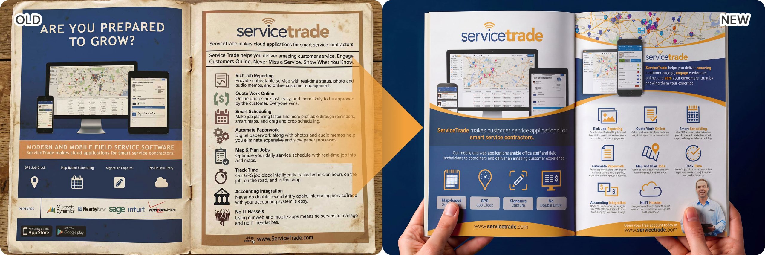
The challenge was to create a magazine advertisement that could communicate multiple software features in a clean, engaging layout while reinforcing the company’s professional and technology-driven brand image.
The final design transformed a feature-heavy advertisement into a visually structured marketing piece that is easier to read, easier to understand, and more likely to capture attention in print publications.
The Challenge
The original advertisement contained a significant amount of information but lacked visual hierarchy.
Readers had to work hard to identify key selling points, making the advertisement less effective within the short attention span typical of magazine readers.
Key challenges included:
- Too much information competing for attention
- Weak visual hierarchy
- Dense text blocks
- Limited emphasis on product benefits
- Outdated overall presentation
- Difficult to communicate multiple software features quickly
The Approach
Rather than reducing information, the objective was to organize it more effectively.
The redesign focused on creating a stronger visual journey that guides readers naturally through the advertisement.
Key improvements included:
Clear Headline
A bold headline immediately communicates the primary value proposition.
Better Information Hierarchy
Content is divided into logical sections, allowing readers to scan the page quickly without feeling overwhelmed.
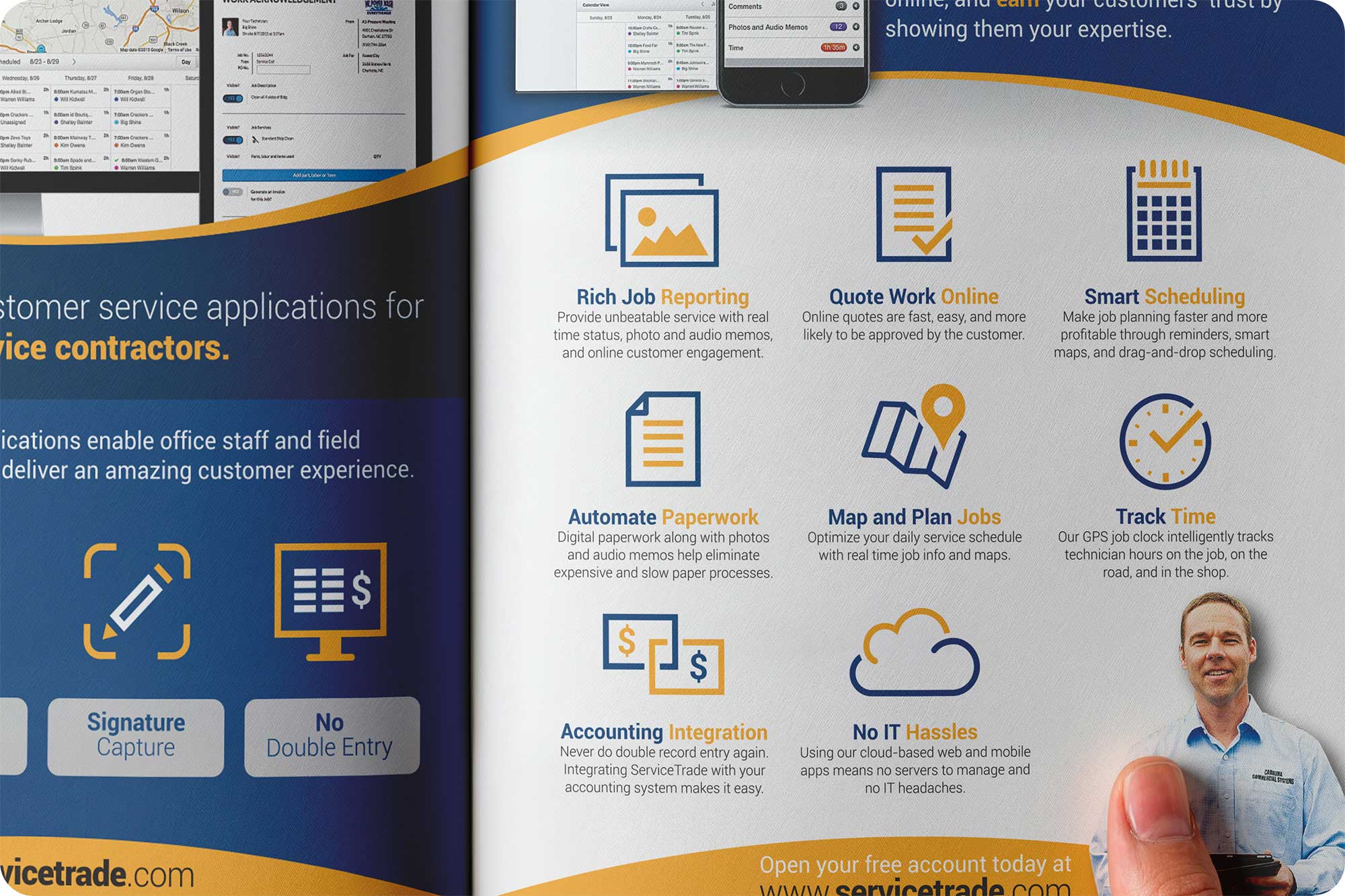
Feature Icons
Each software capability is paired with a simple icon, making complex functionality easier to understand at a glance.
Product Interface Showcase
Real application screenshots were incorporated to demonstrate the platform across desktop, tablet, and mobile devices, reinforcing credibility while showing cross-device functionality.
Strong Brand Consistency
Brand colors, typography, spacing, and visual elements were aligned throughout the layout to strengthen recognition and create a cohesive professional appearance.
Improved Call-to-Action
Important website information and messaging were positioned more strategically to encourage further engagement after readers finish the advertisement.
The Outcome
The redesigned advertisement presents ServiceTrade as a modern, reliable software platform while making complex product information easier to consume.
Instead of overwhelming readers with dense content, the new design creates a structured visual experience that communicates key benefits quickly and professionally.
The final piece successfully balances product education, brand presentation, and marketing impact-making it suitable for industry magazines, trade publications, sales materials, and promotional campaigns.
Before & After Comparison
See how the original advertisement was transformed into a cleaner, more engaging layout.
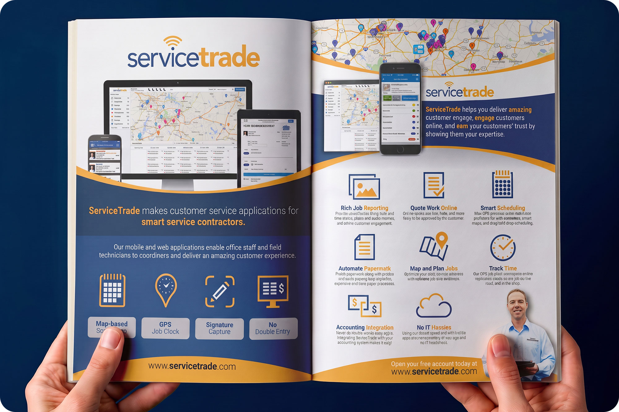
Final Magazine Advertisement
A polished print-ready design featuring stronger hierarchy, clearer messaging, and improved visual communication.
Feature Detail
Close-up views highlight custom icons, typography, and organized content sections that improve readability.
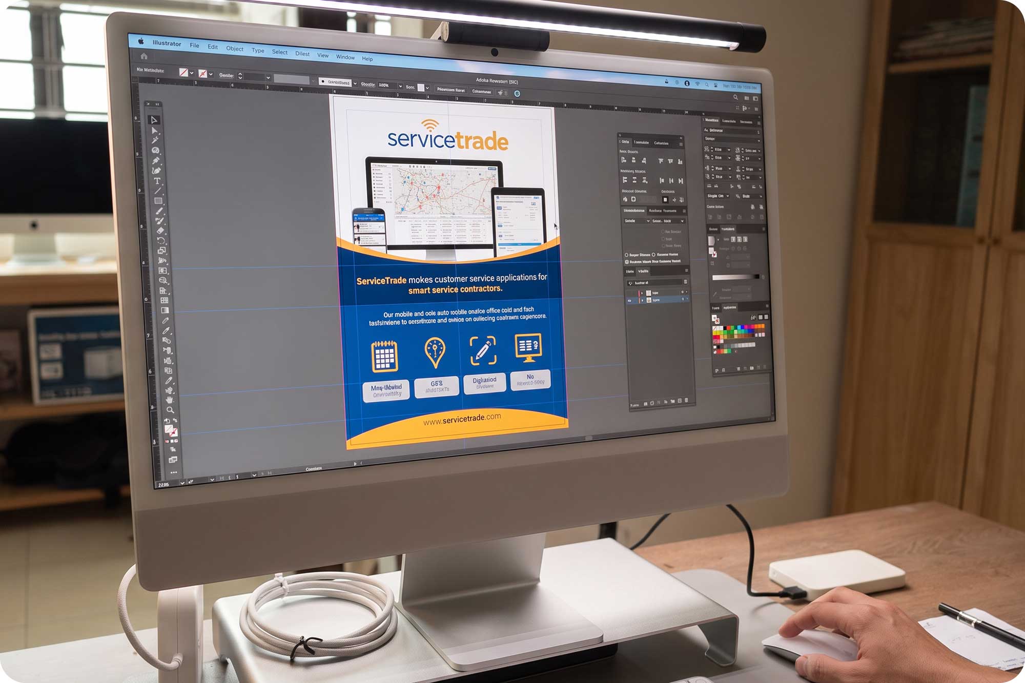
Behind the Design
A look inside the Adobe Illustrator workspace during the layout and production process.
Client
Service Trade
Industry
- Software / SaaS
Services
- Marketing Design
- Print Design
- Brochure Design
- Flyer Design
- Brand Identity Design
Looking to Create Marketing That Gets Noticed?
Whether you’re promoting a special offer, launching a campaign or strengthening customer relationships, professionally designed marketing materials can help your business communicate more effectively and inspire action.
Let’s discuss how strategic marketing design can help support your next campaign.