
A Fresh Identity Rooted in Mediterranean Character
Overview
Kam-Moon is a Mediterranean food brand inspired by the warmth, freshness and cultural character of Egyptian cuisine. Located on Brunswick Street in Halifax, the restaurant served a diverse menu of Mediterranean and Egyptian dishes, with traditional breads and freshly prepared food at the heart of the experience.
The branding was developed to give Kam-Moon a distinctive personality that felt fresh, approachable and handcrafted, while reflecting the natural ingredients and cultural warmth behind the food.
The Challenge
The identity needed to work across a variety of physical and customer-facing applications while remaining recognizable and inviting.
Rather than relying on predictable Mediterranean imagery, the goal was to create a more organic and memorable visual language – one that could communicate freshness and authenticity while still feeling contemporary.
The identity also needed enough flexibility to work across:
- Food packaging
- Takeaway bags
- Café and restaurant signage
- Staff aprons
- Printed materials
- Menus
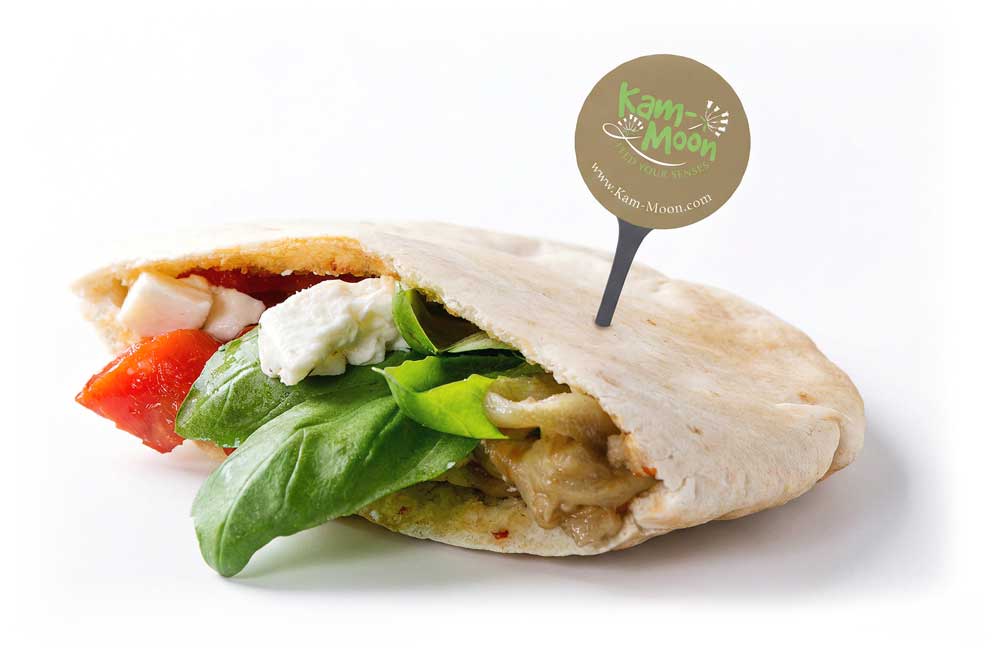
- Small-format applications
The Creative Direction
The visual identity combines hand-drawn typography, botanical details and earthy colour accents to create a warm and expressive personality.
The custom-style “Kam-Moon” lettering gives the brand an approachable, handmade quality, while the illustrated botanical elements introduce a natural connection to fresh ingredients and Mediterranean food culture.
The curved supporting line and tagline, “Feed Your Senses,” complete the mark with a softer, more crafted character.
Logo & Visual Language
The logo was designed as more than a simple wordmark. Its combination of expressive lettering and illustrated elements creates a visual signature that can stand on its own across different applications.
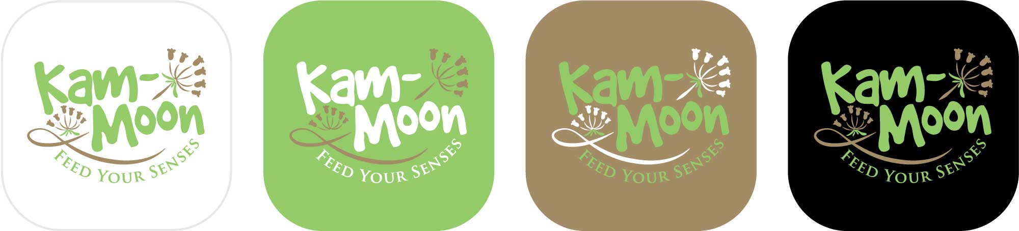
A flexible colour approach allows the identity to move between:
Fresh & natural — green and warm botanical tones
Earthy & authentic — brown and muted natural tones
Bold & contemporary — dark backgrounds with contrasting green
This makes the identity adaptable while maintaining a recognizable core.
Brand Applications
The identity was designed to feel equally natural across physical touchpoints.
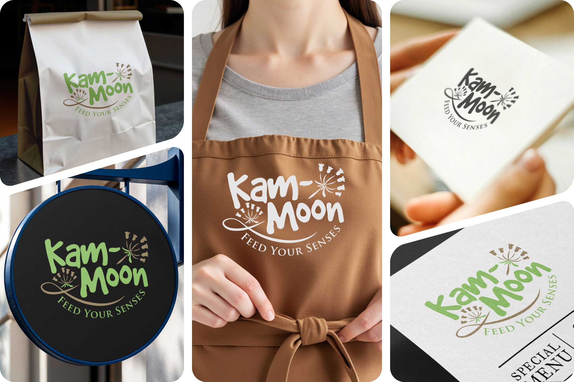
The takeaway bag gives the logo a simple, highly visible presentation, while the apron application turns the identity into part of the customer experience.
The dark circular signage demonstrates how the mark can become a strong environmental element, while the printed collateral provides a more refined application for menus and customer communications.
The Result
The Kam-Moon identity creates a recognizable visual personality that connects the brand with fresh food, natural ingredients and Mediterranean warmth.
From a simple takeaway bag to an apron, storefront sign or printed menu, the identity maintains its character while adapting naturally to each environment.
The project demonstrates how a carefully constructed logo and supporting visual language can turn a food business into a recognizable, cohesive brand experience.
Client
Kam-Moon
Industry
-
Mediterranean / Egyptian Restaurant
Halifax, Nova Scotia, Canada
Project Deliverables
- Logo design
- Custom wordmark
- Illustrated logo elements
- Colour palette
- Typography direction
- Signage application
- Takeaway packaging
- Staff apparel
- Printed collateral
- Brand applications
Behind the Design
The central idea was to make Kam-Moon feel human rather than corporate.
The hand-drawn character of the logo reflects the warmth of a food business where preparation, hospitality and personal connection are important. This was balanced with a controlled colour palette and structured applications to prevent the identity from becoming overly decorative.
The result is a brand system that feels:
Fresh · Warm · Natural · Playful · Authentic · Memorable
Looking to Build a Stronger Brand?
Whether you’re launching a new business or refreshing an existing identity, thoughtful branding can help your business communicate more effectively and leave a lasting impression.
Let’s discuss how strategic branding can support your business goals.