
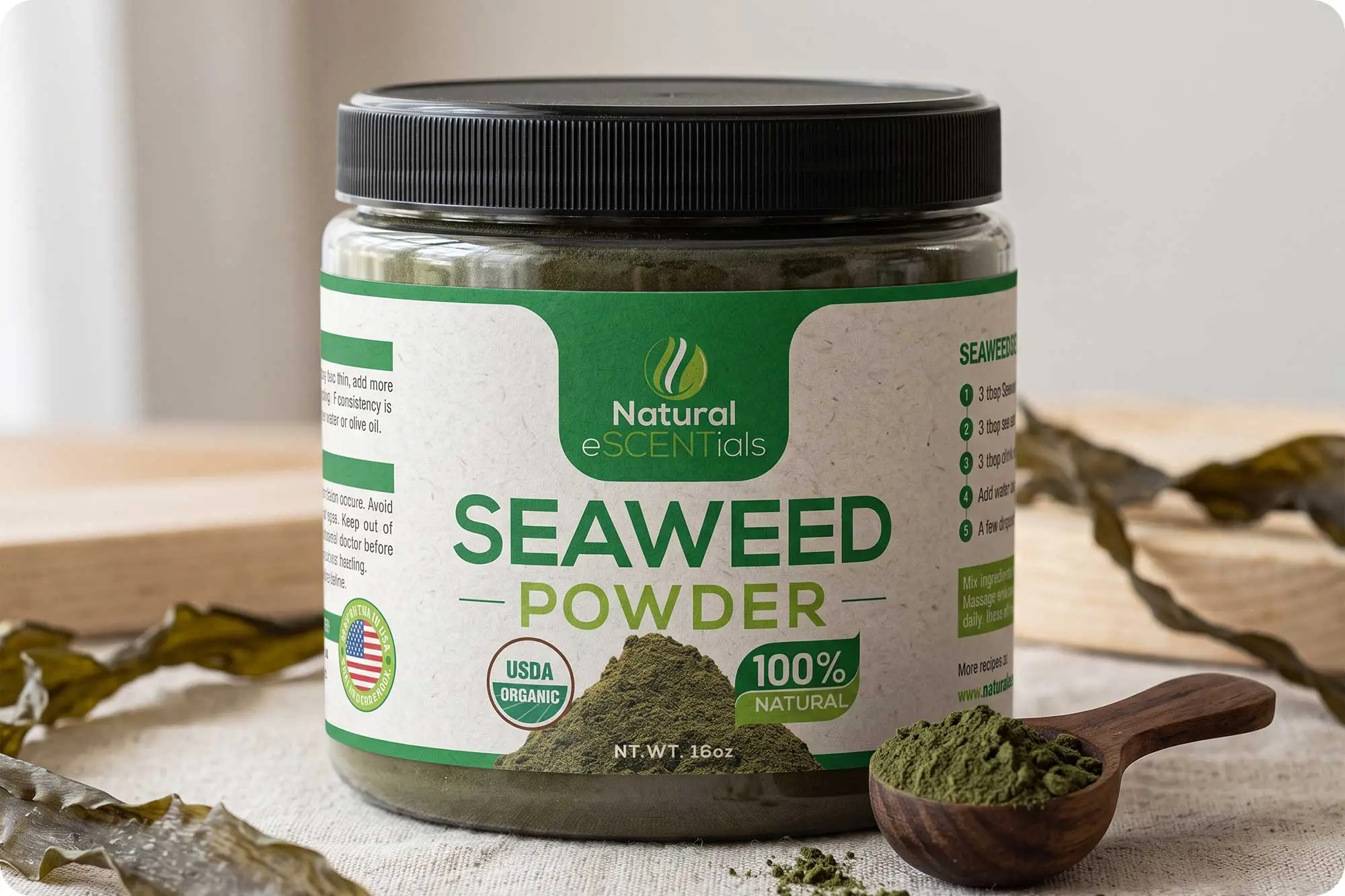
A cleaner, more confident packaging direction for a natural seaweed product.
Overview
Natural eSCENTials Seaweed Powder is a natural wellness product positioned around the simplicity and benefits of seaweed. The packaging redesign focused on creating a stronger visual presence while maintaining the product’s natural, organic character.
The new label combines a fresh green palette, warm natural textures and stronger typography to make the product easier to recognise, understand and trust at first glance.
The Challenge
The original packaging communicated the product’s natural positioning, but the overall visual hierarchy felt somewhat fragmented.
The product name, brand, claims and supporting information competed for attention, while the overall composition lacked a strong focal point.
The challenge was to create a label that could communicate natural quality and product authenticity more effectively while making the main product proposition immediately visible.
The redesign needed to feel natural without becoming overly rustic, and professional without losing the approachable character of an organic product.
The Approach
I approached the redesign by simplifying the visual structure and establishing a much clearer hierarchy.
The product name became the primary visual anchor, supported by a restrained palette of greens and warm off-white tones. Rather than relying heavily on decorative elements, the design uses typography, spacing and controlled colour blocking to create a stronger overall composition.
The result is a label that feels more organised and intentional while retaining the connection to nature that is central to the product.
Behind the Screen
Building hierarchy around the product.
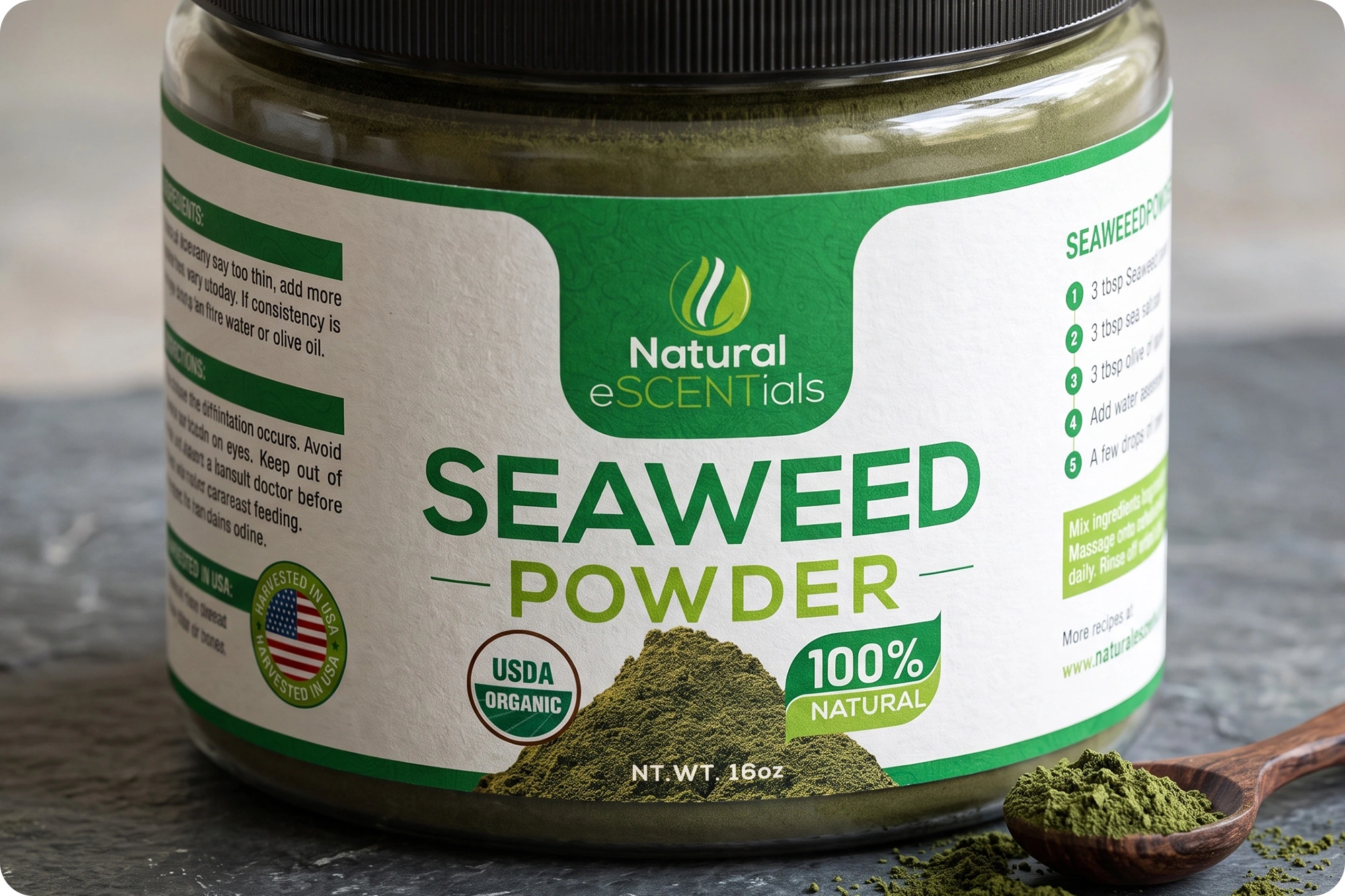
One of the most important changes was the treatment of “SEAWEED POWDER.”
In the original packaging, the product name was relatively small and shared attention with several other elements. In the redesign, it becomes the dominant message on the front panel.
This creates an immediate communication path:
Brand → Product → Key qualities → Product quantity
The larger typography gives the package greater presence and allows customers to understand what the product is within seconds.
Creating a stronger brand presence
The Natural eSCENTials logo was given a more prominent position within a dedicated green brand panel.
This helps separate the brand from the information-heavy areas of the label while creating a recognisable visual signature.
The rounded shape also introduces a softer, more natural character that complements the organic positioning of the product.
Balancing natural and professional
Green was retained as the primary colour because of its strong association with nature, plants and wellness.
Rather than using green throughout the entire label, the redesign combines it with a warm, textured off-white background.
This balance helps the packaging communicate natural authenticity without looking overly rustic or homemade.
The result feels cleaner, more contemporary and more suitable for a premium natural-product category.
Making product claims easier to understand
Supporting elements such as USDA Organic and 100% Natural were reorganised into clear visual badges.
These elements are important trust signals, but they shouldn’t overpower the product name.
By giving them dedicated shapes and controlled positioning, the redesign allows customers to scan the key product benefits without interrupting the primary hierarchy.
Design Philosophy
Natural doesn’t have to mean ordinary.
For natural and wellness products, it’s easy for packaging to fall into familiar visual conventions, green colours, botanical imagery and organic textures.
The goal here wasn’t simply to make the packaging look natural.
It was to make the product feel natural, credible and professionally presented.
The redesign uses a limited visual language:
Green → natural and organic positioning
Warm off-white → authenticity and tactile character
Bold typography → confidence and clarity
Product imagery → immediate recognition
Structured badges → quick communication of key qualities
Together, these elements create a more cohesive visual system without adding unnecessary complexity.
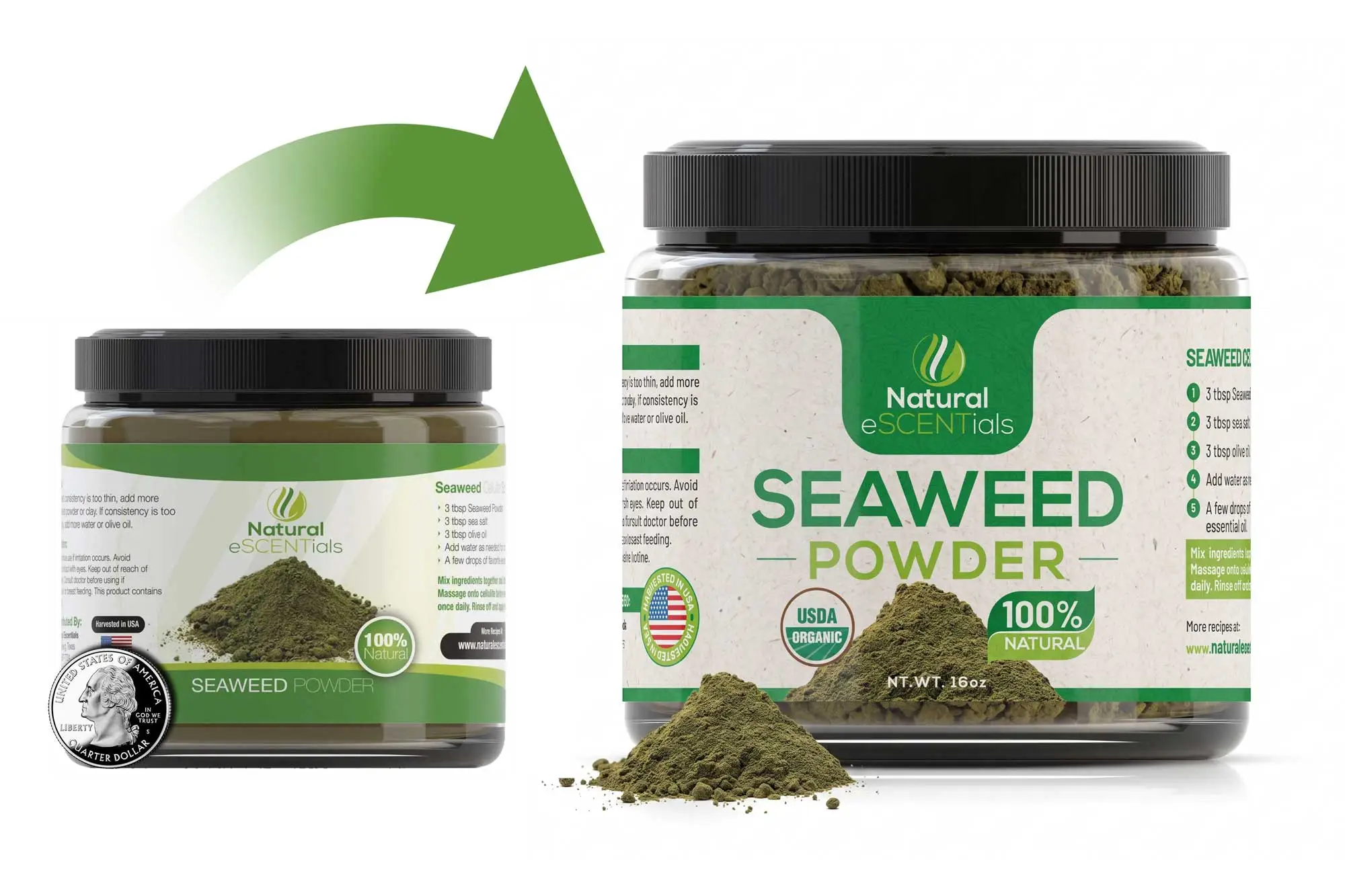
From Before to After
The transformation is primarily about clarity and hierarchy.
The original design had many useful elements, but they competed within the same visual space.
The redesigned label gives each element a more defined role:
Before
- More fragmented hierarchy
- Smaller product messaging
- Multiple competing visual elements
- Less immediate product recognition
After
- Stronger product name
- Clearer brand presence
- More controlled information structure
- Stronger shelf presence
- More contemporary natural aesthetic
The redesign doesn’t attempt to change the product’s character. Instead, it gives that character a clearer and more confident visual voice.
The Result
The final packaging presents Natural eSCENTials Seaweed Powder as a more established and trustworthy natural product.
The stronger typography makes the product immediately identifiable, while the combination of green and warm textured neutrals reinforces its organic positioning.
Most importantly, the redesign demonstrates how thoughtful packaging hierarchy can transform an existing product without relying on excessive decoration.
A cleaner structure.
A stronger product message.
A more confident shelf presence.
Client
Natural eSCENTials
Industry
-
Natural
-
Wellness Product
Focus
- Visual Hierarchy
- Product Positioning
- Information Design
- Packaging Aesthetics
Learn More About Packaging
Why Good Packaging Design Increases Product Sales
Common Packaging Design Mistakes That Cost Brands Customers
Luxury Packaging vs Standard Packaging: Is It Worth the Investment?
6 Packaging Design Trends Every Brand Should Watch
How Packaging Design Builds Brand Recognition
How to Prepare Packaging Artwork for Printing: A Practical Guide
Looking to Refresh Your Product Packaging?
Whether you’re updating an established product or launching a completely new brand, strategic branding and packaging design can dramatically improve how customers perceive your business.
Let’s create packaging that builds trust and stands out on the shelf.