
How to Prepare Packaging Artwork for Printing: A Practical Guide
Designing beautiful packaging is only half the job. Before your product reaches store shelves, your artwork must be prepared correctly for commercial printing.
Even a professionally designed package can encounter costly production issues if the print files aren’t set up properly. Incorrect colours, missing bleed, low-resolution images, or overlooked dielines can lead to delays, additional costs, and disappointing print results.
Whether you’re launching your first product or refreshing an existing packaging line, understanding the basics of print-ready artwork will help ensure a smoother production process.
Start with the Correct Dieline
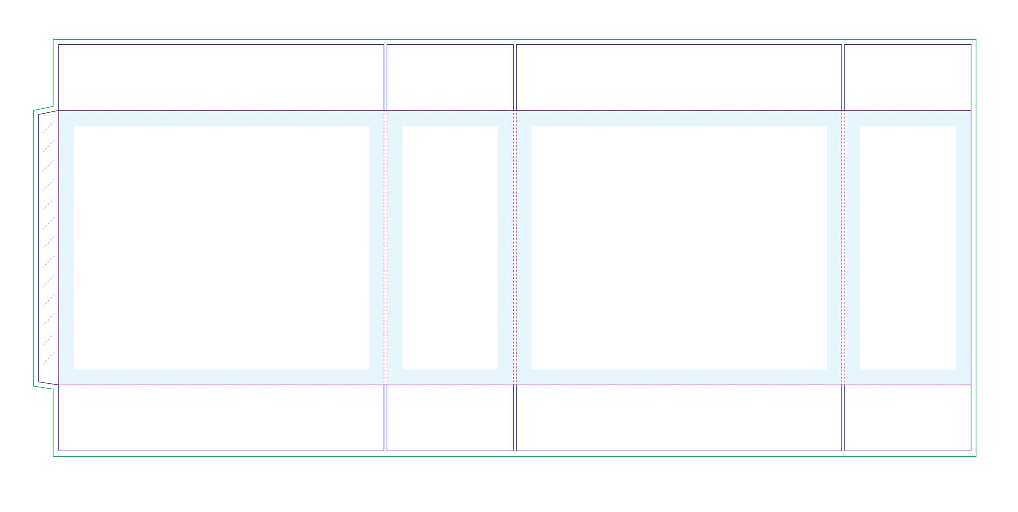
Every packaging project begins with a dieline supplied by the packaging manufacturer.
A dieline shows:
- Cut lines
- Fold lines
- Glue areas
- Safety margins
- Bleed requirements
Design elements should always be placed within the safe area to avoid being trimmed during production.
Using an inaccurate dieline can result in misaligned graphics, hidden text, or packaging that doesn’t assemble correctly.
Use CMYK Colours Instead of RGB
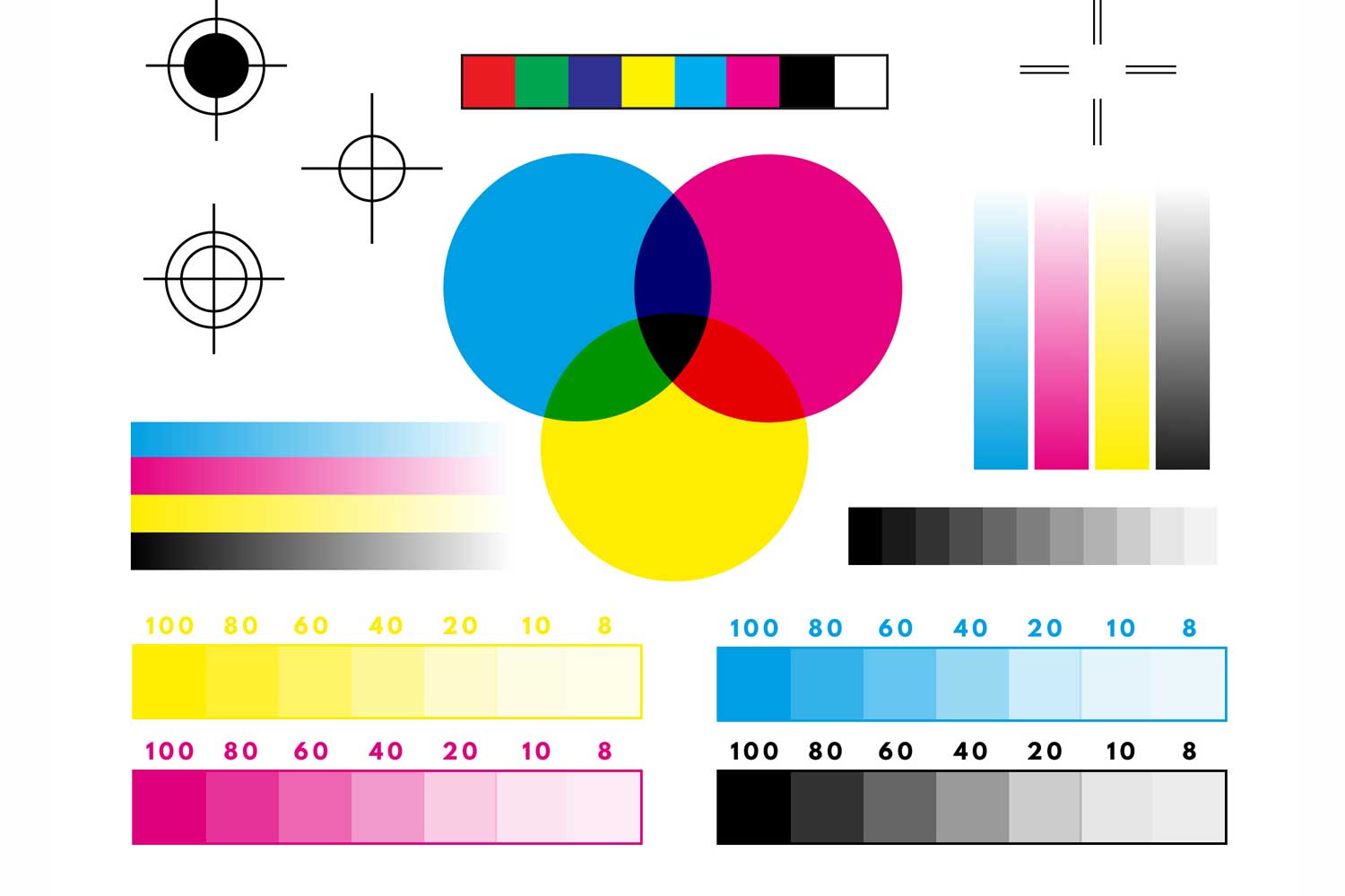
Many designs look vibrant on a computer monitor because they’re displayed in RGB colour mode.
Commercial printing, however, uses CMYK.
If artwork remains in RGB, colours can shift significantly during printing.
Converting artwork to CMYK early in the design process allows you to make colour adjustments before production and achieve more predictable results.
For brands with strict colour requirements, Pantone spot colours may also be recommended.
Include Bleed and Safe Margins
Bleed is one of the most common production mistakes.
Background colours, images, and patterns should extend beyond the trim line so that minor cutting variations don’t leave unwanted white edges.
Most packaging printers require approximately 3 mm of bleed, although specifications vary depending on the manufacturer.
Likewise, important elements such as logos and product names should remain inside the safe area to avoid accidental trimming.
Use High-Resolution Images
Blurry product photography can reduce the perceived quality of your entire brand.
For commercial printing:
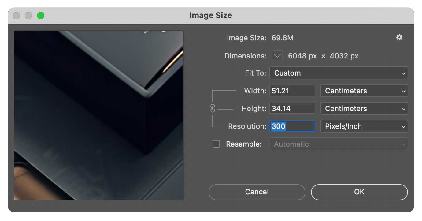
- Images should generally be 300 DPI.
- Avoid screenshots or web images.
- Use original photography whenever possible.
- Ensure linked images remain embedded or properly packaged.
High-quality visuals help produce crisp, professional packaging.
Choose Fonts Carefully
Typography plays a major role in packaging readability.
Before sending artwork to print:
- Outline fonts where appropriate.
- Check minimum font sizes.
- Ensure sufficient colour contrast.
- Avoid extremely thin type on textured materials.
This helps prevent font substitution and improves print consistency across different production facilities.
Consider Special Finishes Early
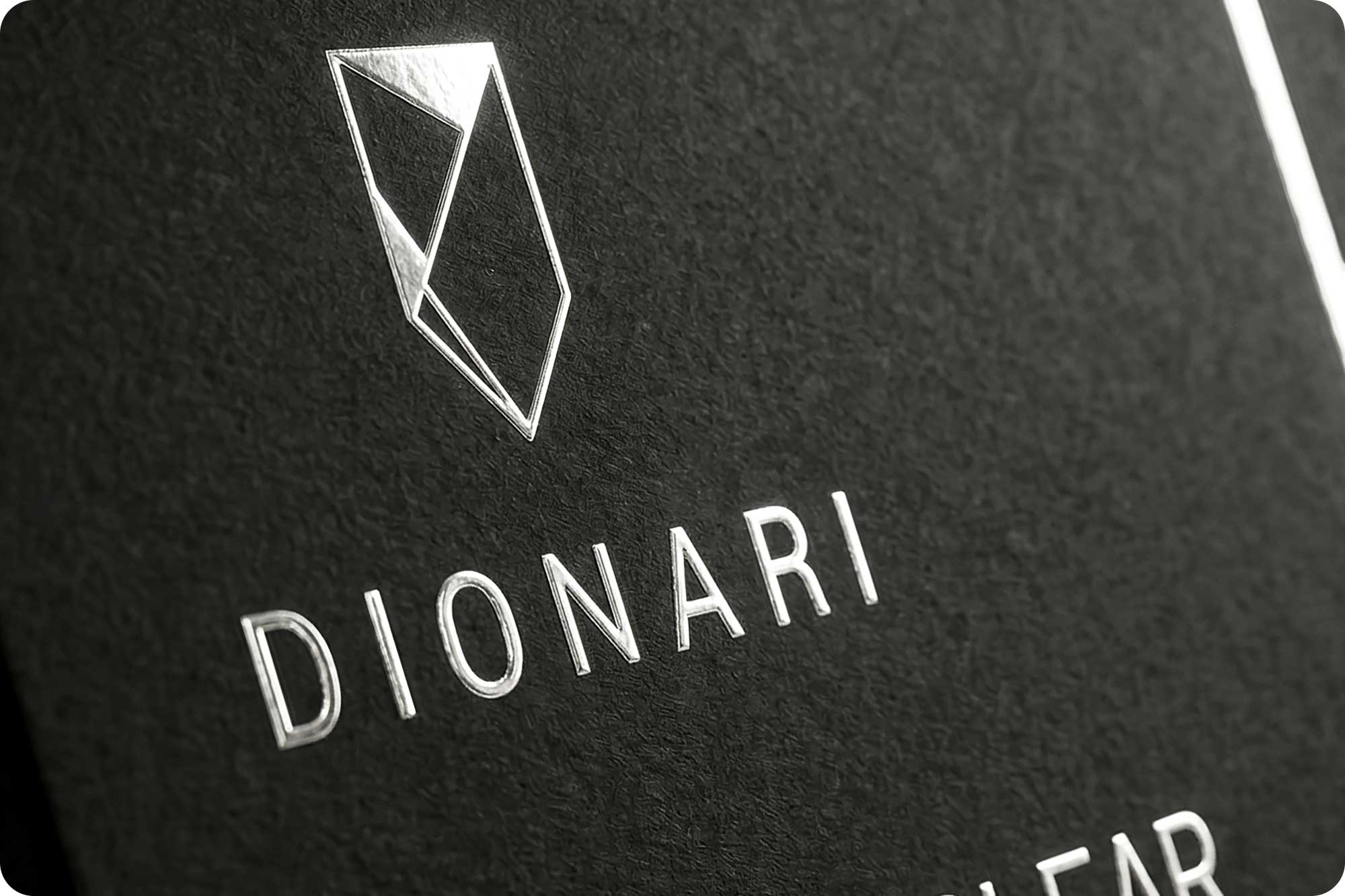
Premium finishes require planning during the design stage.
Common finishing options include:
- Foil stamping
- Spot UV
- Embossing
- Debossing
- Soft-touch laminate
- Matte or gloss coating
Each finish requires separate artwork layers and precise positioning.
Designing with these techniques in mind produces a cleaner and more refined final product.
Double-Check Regulatory Information
For many industries, packaging must include legally required information.
Depending on the product, this may include:
- Ingredients
- Nutrition panels
- Warnings
- Barcodes
- Country of origin
- Batch numbers
- Manufacturer details
Reviewing these elements carefully before printing helps avoid costly reprints.
Export Production-Ready Files
Before delivering artwork to the printer, review the following checklist:
✓ Correct dieline used
✓ CMYK colour mode
✓ Bleed included
✓ Safe margins respected
✓ High-resolution images
✓ Fonts outlined (where required)
✓ Special finishes on separate layers
✓ Linked images embedded
✓ Print-ready PDF supplied
Taking a few extra minutes to complete these checks can prevent expensive production problems later.
Why Professional Print Preparation Matters
Packaging design isn’t only about aesthetics—it also requires technical knowledge.
An experienced packaging designer understands how creative decisions translate into real-world production, ensuring the final product looks just as impressive in print as it does on screen.
By combining thoughtful design with production-ready artwork, businesses reduce delays, minimise printing errors, and achieve consistent quality across every product.
Final Thoughts
The best packaging doesn’t stop at great design. It also performs flawlessly during production.
Preparing artwork correctly helps protect your investment, maintain brand consistency, and deliver the premium experience customers expect.
Whether you’re producing a short-run product launch or large-scale retail packaging, careful print preparation makes all the difference.
Featured Packaging Case Studies
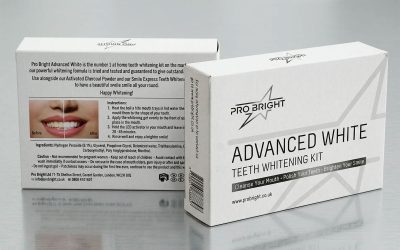
ProBright
Modernising a Whitening Brand Through Strategic Brand & Packaging Design Overview ProBright approached me with an...
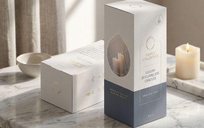
Simply Collected
Elevating Luxury Packaging Through Elegant Simplicity Overview Simply Collected is a premium home décor brand offering...

Evergreen Herbs
Creating Packaging That Builds Consumer Confidence and Shelf Impact Overview Evergreen Herbs is a health and wellness...
Elevate Your Product with Premium Packaging Design
At KitCreativity, I create premium packaging solutions that combine strategic branding with production-ready design. From luxury retail boxes and product labels to complete packaging systems, every project is designed to help businesses build stronger brands and deliver exceptional customer experiences.
View my Packaging Design portfolio or contact me to discuss your next packaging project.