
Creating Packaging That Builds Consumer Confidence and Shelf Impact
Overview
Evergreen Herbs is a health and wellness brand committed to providing natural herbal supplements that support everyday wellbeing. The objective of this project was to design modern, retail-ready packaging that communicates freshness, trust and product quality while helping the brand stand out in an increasingly competitive health supplement market.
The packaging needed to balance strong shelf presence with clear product communication, creating an identity that customers could quickly recognize and trust.
The Challenge
The health supplement industry is highly competitive, with consumers often making purchasing decisions within just a few seconds.
Evergreen Herbs required packaging that could immediately attract attention while communicating a sense of quality, cleanliness and natural wellness. The challenge was to avoid the clutter commonly found in supplement packaging by creating a clean and confident visual identity that remained informative without overwhelming the customer.
The packaging also needed to support future product expansion, allowing additional supplement varieties to be introduced while maintaining consistent brand recognition.
The Approach
Successful packaging design begins long before colours and graphics are applied.
The focus of this project was to understand how customers interact with wellness products on retail shelves and create a packaging system that balances visual impact with clarity.
A bold colour palette was selected to maximize shelf visibility, while clean typography and generous spacing improve readability and create a premium appearance. The layout was carefully structured to guide customers naturally through the product hierarchy-from brand recognition and product name to key ingredients and supporting information.
Every design decision aimed to create packaging that feels approachable, trustworthy and easy to understand.
The Solution
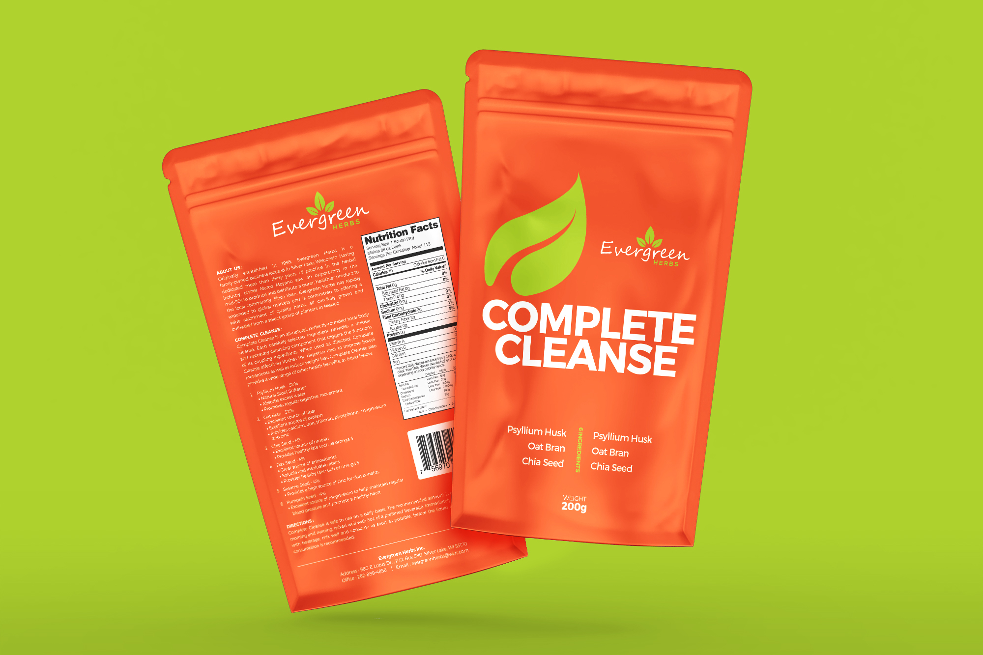
A modern stand-up pouch packaging system was developed to provide both visual consistency and practical flexibility across the product range.
The design emphasizes simplicity, allowing the product name to become the primary focal point while supporting information remains clearly organised and easy to scan.
The packaging system includes:
- Front & Back Packaging Design
- Product Information Layout
- Nutrition Facts Integration
- Ingredient Hierarchy
- Barcode Placement
- Print-Ready Production Artwork
- Flexible Packaging Adaptation
The result is a scalable packaging solution that can easily accommodate future products while maintaining a strong and consistent brand identity.
The Outcome
The final packaging presents Evergreen Herbs as a modern and trustworthy wellness brand that communicates confidence through clean, thoughtful design.
The bold shelf presence helps capture customer attention, while the organised information hierarchy improves readability and reinforces product credibility.
By combining attractive aesthetics with practical functionality, the packaging provides Evergreen Herbs with a cohesive visual system capable of supporting future product growth across retail and e-commerce channels.
My Design Philosophy
Packaging is often the first physical interaction customers have with a product.
Great packaging should do more than look attractive-it should capture attention, communicate quality and make purchasing decisions easier.
For Evergreen Herbs, every design decision focused on creating a balance between visual simplicity and commercial effectiveness, ensuring the product feels trustworthy from the very first glance.
Client
Evergreen Herbs Inc.
Industry
- Health & Wellness
- Dietary Supplements
- Natural Herbal Products
Services
- Packaging Design
- Product Label Design
- Brand Visual Development
- Print Production Artwork
- Packaging System Design
Project Highlights
- Stand-Up Pouch Packaging Design
- Retail Shelf Optimisation
- Clean Information Hierarchy
- Print-Ready Production Files
- Scalable Packaging System
- Brand Consistency
Behind the Design
The oversized product name was intentionally positioned as the primary focal point to improve shelf visibility, while the bright colour palette reinforces freshness and natural vitality. Supporting information was arranged in a structured hierarchy to help customers quickly identify the product and key ingredients without visual clutter.
Looking to Elevate Your Product Packaging?
Whether you’re launching a new product or refreshing an existing range, professionally designed packaging can help your brand stand out, build customer confidence and create a lasting impression on the shelf.
Let’s discuss how strategic packaging design can help bring your product to market with confidence.